Advanced Typography | Task 2: Key Artwork and Collateral
20.05.2024 - 21.06.2024 || Week 05 - Week 09
Hanson Pea Wei Hao || 0359463
Advanced Typography || Bachelor of Design (Honours) in Creative Media || Taylor's University
Task 2: Key Artwork and Collateral
Hanson Pea Wei Hao || 0359463
Advanced Typography || Bachelor of Design (Honours) in Creative Media || Taylor's University
Task 2: Key Artwork and Collateral
Lists
1. Lectures
2. Instructions
3. Feedbacks
4. Reflections
Lectures
All the lectures are in Task 1: Exercise
Instructions
Part 1: Key Artwork
For This Task, I have tried using my name Hanson Pea to combine with a brand name, Hapea. It has the same pronouns as happy and I always like to be happy
Fig 1.1, Sketch and Idea
After Deciding the fonts and design, I next need to consider my color choice.

Fig 1.2, Colour Idea 1
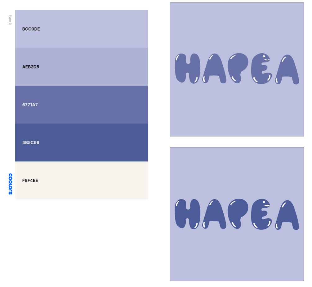
Fig 1.3, Colour Idea 2

Fig 1.4, Colour Idea 3

Fig 1.5, Colour Idea 4
Most of the colour choice didn't get to work, So I find a new colour for it.
.jpg)
Fig 1.6, Final colour choose
Part 2: Key Collateral
For collateral, I have created a few logos for myself,

Fig 2.1, Logo 1

Fig 2.2, Logo 2

Fig 2.3, Logo 3
After Having the logo, I planned for my collateral, I want to make a brand that can be used for daily life, So I chose collateral with clothes, boxes, and tote bags.

Fig 2.4, Cloth design

Fig 2.4, Box design

.jpg)
Fig 2.5, totebag Design
After that, I need a picture of myself and add my watermark.

Fig 2.6, Original picture
.jpg)
Fig 2.6, Picture with watermark
Final Key Artwork and Key Collateral
Task 2(A)

Fig 3.1, Black wordmark on white background

Fig 3.2, White wordmark on black background

Fig 3.3, Final Key Artwork Colour palette

Fig 3.4, Lightest Shade on Darkest Shade

Fig 3.5, Darkest Shade on Lightest Shade
Fig 3.6, Workmark animation

Fig 3.7, Collateral 1
.jpg)
Fig 3.7, Collateral 2

Fig 3.7, Collateral 3

Feedbacks
Week 5
Specific Feedback: Most of the ideas are interesting. Quite like the pixel words, but if need to use it need more exploration about I, because for now, it looks so common. The balloon design is also good but needs to improve a bit.
Week 6
Specific Feedback: the letterform is acceptable. Just need to remove the hat and make the stuff inside the letterform more thicker a bit. the color choice is not gonna work, need to redo it.
Week 7:
Specific Feedback: The color choice for the Instagram picture is not approved and the picture should be taken in front of the white wall from the design classroom.
Week 8:
Specific Feedback: The Colour Looks like is not workable, try to redo and the picture should take from the white wall outside the studio.
Reflections
Experience:
When doing this task, I felt very interested when I started designing my own Word mark. Other than that, I am pretty sure I suffer in choosing the color, but in the end, all look good for me.
Observation:
I think it's pretty hard to choose the color palette. I have noticed that Lots of the designs from my classmates or past year students, they really did well in choosing their color palette. With a good color, they can make their design very wonderful and outstanding.
Findings:
I get to learn so much in this Task. To create your own brand, a good wordmark is essential. But the energy and creativity required to create a good trademark is really nerve-wracking. When going on this wordmark, I really faced so much difficulty challenge during this task and learned how to be adaptive for most of the task.
Further Readings
.jpg)
Fig 4.1, Just My type
Garfield begins by emphasizing how fonts are all around us, often going unnoticed. From road signs to websites, the choice of typeface affects our perception and interaction with the world. he also discusses how different fonts can evoke various emotions and responses. For example, a font can be seen as trustworthy, playful, serious, or informal, influencing how the message is received. Garfield touches on how brands carefully select typefaces to convey their identity and values. This selection is crucial for creating a recognizable and consistent brand image.
To illustrate the significance of typography, Garfield includes anecdotes and historical examples. These stories serve to engage the reader and underscore the deep-rooted history and evolution of typefaces. introduces some of the themes that will be explored in more detail throughout the book, such as the development of specific fonts, the stories of their creators, and the technical aspects of typography.


Comments
Post a Comment