Advanced Typography | Task 1: Typographic Systems & Type, & Play
22.04.2024 - 12.05.2024 || Week 1 - Week 3
Hanson Pea Wei Hao || 0359463
Advanced Typography || Bachelor of Design (Honours) in Creative Media || Taylor's University
Task 1: Typographic Systems & Type, & Play
Hanson Pea Wei Hao || 0359463
Advanced Typography || Bachelor of Design (Honours) in Creative Media || Taylor's University
Task 1: Typographic Systems & Type, & Play
Lists
1. Lectures
2. Instructions
3. Feedbacks
4. Reflections
Lectures
Week 1: Typographic System
"All design is based on a structural system". According to Elam, there are eight major variations with an infinite number of permutations, those are :

- Axial
- Radial
- Dilatational
- Random
- Grid
- Modular
- Transitional
- Bilateral
- Axial System: All elements are arranged on either side of an axis or line.

fig 1.1, Axial System
- Radial System: all elements are organized to extend from a central point of focus like rays

fig 1.2, Radial System
- Dilatational System: type set along circular paths.

fig 1.3, Dilatational System
- Random System: organizes the elements randomly without a definite aim, pattern, direction, rule, method, or purpose.

fig 1.4, Random System
- Grid System: a combination of invisible lines(vertical or horizontal )that divide a page into sections and help organize content, including type, images, and UI elements.

fig 1.5, Grid System
- Transitional System: layering of lines of text into informal textured planes and shifting tonal bands.

fig 1.6, Transitional System
- Modular System: A series of non-objective elements that are constructed as a standardized unit.


fig 1.8, Bilateral System
Week 2: Typographic Composition

Fig 2.1, Example of Emphasis in Typographic Composition

Fig 2.2 Rule of Thirds in Typographic Composition
Rule of Thirds: A photographic composition guide that suggests dividing a frame (space) into three columns and three rows. The intersecting lines are used as a guide for placing the points of interest within the available space. However, it is rarely used in typographic compositions.
Typographic Systems

Fig 2.3 Paula Scher, Jonathan Barnbrook, David Carson
In the postmodernist era, younger designers experimented with chaos, randomness, and asymmetry. Designers relied heavily on intuition and instinct, and there was order to the chaos. Asymmetry, randomness, repetition, dilational, and radial systems began to emerge. David Carson, Paula Scher, and Jonathan Barnbrook expertly combined legibility and readability.

Fig 2.4 Environmental Grid
Environmental Grids: Based on the exploration of an existing structure or combination of structures. An extraction of critical lines, both curved and straight, is created. The designer arranges the data around this superstructure, which contains non-objective elements, to create a distinct combination of texture and visual stimuli. The system is built around key features of an environment that provide context for the forms created in the design.

Fig 2.5 Form and Movement
Week 3: Context and Creativity
Handwriting

Fig 3.1 Evolution of the Latin Alphabet
Studying handwriting is important because the first mechanically produced letterforms were designed to directly imitate handwriting. Handwriting is the standard basis for form, spacing and conventions of mechanical type that we try and mimic.
Letterforms shape and line are influenced by the tools and materials used to make them. Some tools that contributed to the unique characteristics of the letterform are Sharpened bones, Charcoal sticks, Plant stems, Brushes, Feathers, and steel pens.
Another factor that contributed to the unique characteristics of the letterform lies in the material it was written on, such as clay, papyrus, palm leaf, animal skins (vellum and parchment), and paper.

Fig 3.2, Cuneiform
Written from left to right.
Distinctive wedge results from pressing the blunt end of a reed stylus into wet clay tablets.
Characters evolved from pictograms.

Fig 3.3 Hieroglyphics (2613 - 2160 B.C.E)
The Egyptian writing system. Fused with the art of relief carving. The system is a mixture of both rebus and phonetic characters. Hieroglyphics images could be used as ideograms, determinations, and phonograms. Ideograms: To represent the things they actually depict. Determinatives: To show that the signs preceding are meant as phonograms. Phonograms: To represent sounds that "spell out" individual words.
Fig 3.4 Early Greek System
Written freehand, not constructed with compasses and rules, no serifs. The strokes of these letters grew thicker, the aperture lessened, and serifs appeared. Model for calligraphy in the past 2000 years.

Fig 3.5 Roman Uncials

Fig 3.6 English Half Uncials (8th C.)
The uncials evolved into a more slanted and condensed form. While English and Irish uncials evolved, the European continent devolved considerably and needed a reformer and that is when Carolingian Handwriting Reform came in.

Fig 3.7 Carolingian Minuscule


Fig 3.8 Blackletter
Gothic is an artistic expression, occurring roughly from 1200-1500, and originated with the Italians who referred to rude or barbaric cultures north of the Italian Alps. Characterized by tight spacing and condensed lettering. Evenly spaced verticals dominated the letterform. Condensing line spacing and letter spacing reduced the amount of costly materials in book production.

Fig 3.9 The Italian Renaissance (Antica)
Humanist scholars were reviving the culture of antiquity. Humanists named the newly rediscovered letterforms 'Antica'. The Renaissance analysis of form that was being applied to art and architecture was directed toward letterforms, resulting in a more perfect or rationalized letter.
Fig 3.10 Movable Type
Printing on wood blocks has already been practiced in China, Korea, and Japan. The earliest known printed book (AD 868) is Diamond Sutra, with the world’s first printed illustration. Koreans established a foundry to cast movable type in bronze, allowing the dismantling and resetting of text. The movable type was introduced in 1000-1100 CE. Pioneered by China but achieved in Korea.
Fig 3.11 Evolution of Middle Eastern Alphabets
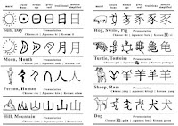
Fig 3.12 Evolution of Chinese Script

Fig 3.13 Indus Valley Civilization (IVC) Script

Fig 3.14 Brahmi Script

Fig 3.15 Writing Systems in Southeast Asia
Pallava: A South Indian script originally used for writing Sanskrit and Tamil. Highly influential, became the basis for writing systems across Southeast Asia.Pra-Nagari: Indian script used in the Malay Archipelago for writing Sanskrit.
An early form of the Nagari script.
Kawi: Indonesia's most important historical script. Based on Nagari, but indigenous to Java, usually used for contacting other kingdoms. It is also the basis of other scripts in both Indonesia and the Philippines.
Incung: The original writing system from Kerinci. Its comes from a South Sumatran grouping of scripts known as Rencong.
Programmers & Type Design

Fig 3.16 Baloo
More vernacular and ‘multi-script’ typefaces are being produced to cater to situations where written matter is communicated in vernacular script or vernacular and Latin script.
Type design carries a social responsibility so one must continue to improve its legibility.
Type design is a form of artistic expression.


Designed by the Swiss type designer Adrian Frutiger, who also designed Univers type. A sans serif typeface. Developed for the Charles De Gaulle International Airport in France. The letterform needed to be easily readable even when the reader was moving and is easy to see from both close up and far away.
Tested with unfocused letters to see which letterforms could still be identified in poor light conditions or when the reader was moving quickly past the sign.


Fig 4.2 'Verdana' Typeface by Matthew CarterMany of Carter's fonts were created to address specific technical challenges. Commissioned by Microsoft to create a typeface designed for the screen. The font was extremely legible even at very small sizes on the screen. Characteristics derived from the pixel rather than the pen, the brush or the chisel.

Commissioned by AT&T which wanted a new typeface for use in their telephone directories and to solve problems related to the existing phonebook typeface, Bell Gothic. Design ink traps to prevent ink spread when printing on low-quality paper at high speeds.
\


Week 4: Designing type
Type design is a form of artistic expression.
Fig 4.1 'Frutiger' Typeface by Adrian Frutiger
Designed by the Swiss type designer Adrian Frutiger, who also designed Univers type. A sans serif typeface. Developed for the Charles De Gaulle International Airport in France. The letterform needed to be easily readable even when the reader was moving and is easy to see from both close up and far away.
Tested with unfocused letters to see which letterforms could still be identified in poor light conditions or when the reader was moving quickly past the sign.
Fig 4.2 'Verdana' Typeface by Matthew CarterMany of Carter's fonts were created to address specific technical challenges. Commissioned by Microsoft to create a typeface designed for the screen. The font was extremely legible even at very small sizes on the screen. Characteristics derived from the pixel rather than the pen, the brush or the chisel.
Fig 4.3 'Bell Centennial' Typeface by Matthew Carter (Font vs. Printed)
Commissioned by AT&T which wanted a new typeface for use in their telephone directories and to solve problems related to the existing phonebook typeface, Bell Gothic. Design ink traps to prevent ink spread when printing on low-quality paper at high speeds.
\
Fig 4.4 'Johnston Sans' Typeface
Previously known as the "Underground" typeface. Commissioned by London's Underground Railway to create a standardized font for their posters and signage. Used the proportions of Roman capital letters which had a lot of history in traditional calligraphy, but was also simple enough to fit the modern age.
General Process of Type Design
- Research:
Before creating a type, it is essential to understand type history, type anatomy and type conventions. Determine the type's purpose, what it would be used for, and what different applications it will be used in (such as for school buses or airport signage, etc.). Study existing fonts that are presently used for inspiration/context/usage patterns/ideas/etc. - Sketching:
Sketching can be done with both traditional tool sets (brushes/pens, ink and paper) and then scanned for the purpose of digitization, or with digital tools such as Wacom, directly into a font design software. Both methods have their positives and negatives, just use whatever works for you. - Digitization:
Using professional software such as Fontlab and Glyph Apps. Attention should not be given to the whole form at this stage but also the counter form the readability of the typeface is heavily dependent on it. - Testing:
Testing is a part of the refining and correcting aspects of the typeface. Prototyping is part of the process and leads to important feedback. - Deploy:
Deploying a typeface does not mark the end of the revision. Teething problems may emerge after the prototyping and testing phases.

Fig 4.5 Construction Grid for Roman Capitals using 8 x 8 cells
Construction & Considerations

Fig 4.6 Classification according to form and construction
Depending on their form and construction, the 26 characters of the alphabet can be arranged into groups. A distinction is made between a group for the capitals and a group for lowercase letters.

Fig 4.7 Overshoots
Many different forms and constructions must be taken into account when creating a new type. One of the important visual corrections is the extrusion of curved and protruding forms past the baseline and cap line (overshoot). This also applies to vertical alignment between curved and straight forms.

Fig 4.8 Comparison of Humanistic and Didone Typeface
A visual correction is also needed for the distance between the letters. A consistent 'visual' white space between letters must be created because some letters next to each other may not look good with equal spacing. The white space between letters should look the same (fitting type).

Fig 5.1, Size

Fig 5.2, Weight

Fig 5.3, Form

Fig 5.4, Structure

Fig 5.5, texture
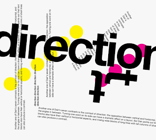
Fig 5.6, direction

Fig 5.7, Colour
- Size: A contrast of size provides a point to which the reader’s attention is drawn. The most common use of size is in making a title or heading noticeably bigger than the body text.
- Weight: Describes how bold type can stand out in the middle of the lighter type of the same style. Using rules, spots, and squares also provides a “heavy area” for a powerful point of visual attraction or emphasis.
- Form: The distinction between a capital letter and its lowercase equivalent, or a Roman letter and its italic variant, condensed and expanded versions of the typeface are also included under the contrast of form.
- Structure: The different letterforms of different kinds of typefaces. For example, a monoline sans serif and a traditional serif, or an italic and a blackletter.
- Texture: By putting together the contrasts of size, weight, form, and structure, and applying them to a block of text on a page. Texture refers to the way the lines of type look as a whole up close and from a distance.
- Direction: The opposition between vertical and horizontal, and the angles in between.
- Colour: The use of colour suggests that a second colour is often less emphatic in values than plain black on white. It is important to give thought to which element needs to be emphasized and to pay attention to the tonal values of the colours that are used.

fig 5.8, Gestalt Principle of Grouping
- The Law of Similarity: States that elements that are similar to each other tend to be perceived as a unified group
- The Law of Proximity: States that elements that are close together tend to be perceived as a unified group.
- The Laws of Closure: Refers to the mind's tendency to see complete figures or forms even if a picture is incomplete. partially hidden by other objects, or if part of the information needed to make a complete picture in our minds is missing.
- The Laws of (Good) Continuation: Says that human tend to perceive each of two or more objects as different, singular, and uninterrupted object even when they intersect.
- The Laws of Symmetry: States that when humans perceive objects, they tend to see them as symmetrical shapes that form around their center.
- The Laws of Präganz: Sometimes known as the law of simplicity, when humans are presented with complex or ambiguous objects, our brains will make them as simple as possible.
Instructions
Exercise 1: Typographic Systems
After the briefing section, we need to design based on The 8 systems we learned which are Axial, radial, Dilatational, Random, Grid, Modular, Transitional, and Bilateral. After that, we need to choose The best from each of them.
Note:
- Size 200 x 200 mm.
- In addition to black, you can use one other color.
- Graphical elements (line, dot, etc.) can be used but limitedly.

Fig 6.1, Initial design for 8 system | (30.04.2024)
After I got feedback, I made some changes to some of the designs.
Final for Submission
Final Typographic System Layout (JPEG)
.jpg)
Fig 6.2, Final Axial layout (Jpeg)| (05.05.2024)
2.jpg)
Fig 6.3, Final Radial layout (Jpeg)| (05.05.2024)
3.jpg)
Fig 6.4, Final Dilatational layout(Jpeg)| (05.05.2024)
4.jpg)
Fig 6.5, Final Random layout (Jpeg)| (05.05.2024)
5.jpg)
Fig 6.6, Final Grid layout(Jpeg)| (05.05.2024)
6.jpg)
Fig 6.7, Final Modular Layout(Jpeg)| (05.05.2024)
7.jpg)
Fig 6.8, Final Transitional Layout (Jpeg)| (05.05.2024)
8.jpg)
Fig 6.9, Final Bilateral Layout (Jpeg)| (05.05.2024)
Fig 6.10, Final typographic system layout without gridline (PDF)| (05.05.2024)
Fig 6.11, Final typographic system layout with gridline (PDF)| (05.05.2024)
Exercise 2 | Type and Play
For my image, I have chosen a lightning picture for it.

Fig 7.1, chosen lightning picture|(02.05.2024)

Fig 7.2, Word chosen from picture|(02.05.2024)
So I have chosen V, L, A, and X in the picture.

Fig 7.3, Progress for Letterform| (02.05.2024)
After getting feedback from Mr. Vinod, I have realized Univers LT Std is not suited to this idea. So I redo and added some detail to my final product.

Fig 7.4, Progress by using Futura Std light|(08.05.2024)
After having my Fonts, I will start doing the movie poster. So I find another picture for my movie poster.

Fig 7.5, Electric in bottle| (09.05.2024)

Fig 7.6, First draft of movie poster|(09.05.2024)
After getting some feedback from Mr.Vinod I found out I forgot to put the movie company logo and need to make a little change for my poster.

Fig 7.7, Movie poster| (15.05.2024)
Final Submission

Fig 7.8, Image| (15.05.2024)
Fig 7.9, extraction| (15.05.2024)

Fig 7.10, Reference type| (15.05.2024)

Fig 7.11, Entire process| (15.05.2024)

Fig 7.12, Initial extraction| (15.05.2024)

Fig 7.13, Final refinement| (15.05.2024)

Fig 7.14, Final Movie Poster| (15.05.2024)
Feedbacks
Week 1:
Specific Feedback: doing reference with other artwork, or reference to past year students for the blog stuff.
General Feedback: Remember to update the blog. If not understand what to do can reference past year students.
Week 2:
Specific Feedback: The random is not random enough, should try again. The other is some of the mistakes made by the other, please make other people's feedback be yours if it applies to yours.
General Feedback: For the e-portfolio, try to combine all the pictures it in the same section to make it not look very messy.
Week 3:
General Feedback: The words doing is lightning, but doesn't feel the lightning part. Need to study more about extraction and redo the words. try to make it feel like lightning and do the poster. For example, you can put some lightning branch into your words
Specific Feedback:
Week 4:
Specific Feedback: Colour multiple in the poster can always be made legible. The poster missing of movie's logo, and the words do a bit not work because the symbolic wanna try inside looks too small.
General Feedback: Always remember to update your feedback in the Feedback Form.
Reflections
Experience:
For Exercise 1, designing layouts based on the 8 system is pretty fun for me, I am pretty happy with my result in my 8 system. The most challenging systems for me have to be random. Although I already try so many times I still feel like it isn't random enough.
For exercise 2, I learn a lot about like how to analyze a pic and make letterforms about it. It's pretty hard for me because I don't really get the sense of idea when I create my letterform. But for the result, although it is not a good one, but I am satisfied with it.
Observation:
For exercise 1, I find out that color of choice will also matter in the final result of the 8 system.
For exercise 2, The observation for pictures and creating a recognizable font is a bit too hard, and still a long way to go. We need to keep the consistency from the image and can't make the letterform too different from the typeface we take for reference.
Findings:
For exercise 1, It's really a good exercise to improve myself learn about the 8 system layout.
For exercise 2, after try out thee process of making letterform, i eel like I still need more practice on it to improve my observation and creating skill.
Further Readings

Fig 8.1, The Anatomy of Type: A Graphic Guide to 100 Typefaces
this is quite an interesting book which is about a visual treat for anyone who loves fonts and typographic design. The Anatomy of Type explores one hundred traditional and modern typefaces in loving detail, with a full spread devoted to each entry. The full character set from each typeface is shown, and the best letters for identification are enlarged and annotated, revealing key features, anatomical details, and the finer, often-overlooked elements of type design. Containing in-depth information on everything from the designer and foundry, the year of release, and the different weights and styles available, The Anatomy of Type is more than a reference guide to the intricacies of typeface design. It is a visual send-up of some of the world's most beloved typefaces, whimsically displayed in vibrant color.


Comments
Post a Comment