Typography/ Task 1:Exercise
25 September 2023/ Week 1- Week 6
List/ Jump link
Mr Vinod has briefed us on the module information booklet and ideas about how we going to start the module. He also talks about the rules and some advice for typography. Then, the class started, and we followed a video he made by himself about how to create a blog in Blogger. In the video, we learn about how to use compose and HTML, label the blog, and more.
Lecture 1:
Typo_0_Introduction
-The importance of typography in our daily life.
Mr Vinod checked a few people's blogs to confirm that we did correctly in Week One and pointed out what is the problem with the blog. After that, he asked us to send our sketch in week one on Facebook to give us a check. He gives some feedback to people to learn from other people's sketch ideas. He also showed some of the past year's student designs to us. After that, He asked us to do the illustrator by following another video he made about to do it. Unfortunately, I haven't got access to access adobe Creative Cloud yet.
Lecture 2:
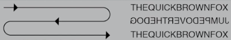
Early Letter development / Timeline:Phoenicians wrote from right to left.
Greek developed 'boustrophedon' a style of writing in which lines of text which read alternately from right to left and left to right.
Etruscan (and then Roman) paint letterforms before inscribing it.

Square capitals are letterforms that have serifs added to the finish of the main strokes.

Rustic Capitals are a compressed version of square capitals. It took less time to write but was slightly harder to read.

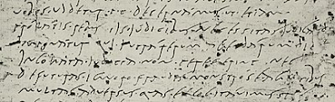
Roman cursive was used for everyday transactions and generally for speed. This was the beginning of lowercase letterforms.
Uncials are lowercase and uppercase combined.

Half-uncials are the formal beginning of lowercase letterforms.

Charlemagne introduced uppercase and lowercase letters, capitalization, and punctuation which allowed for a more standard writing system and a more accurate way to convey messages.
Different places in Europe found their own letterforms to their liking.
Gutenberg with his engineering, metalsmithing, and chemistry skills made a machine where documentation of information is much more efficient.

As Usual, Mr.Vinod checked our work and gave feedback for the E-portfolio. After that, he asked us to send digital artwork to give feedback. He also provided some ideas for creating words and then he asked us to watch the tutorial to make animation and upload the gif on Facebook and explain what we should do before the next class.
Lecture 3:
Tracking and kerning:


fig 2.2, the example of a line space
 fig 2.3, Difference between line spacing and leading


Mr.Vinod asked to send the GIF animation that we designed to the Facebook group. us to make an anonymous comment on Menti.com to give feedback about himself and the typography class. After this, he gave feedback on our GIF animation in class. After the feedback section, We started our new task which is text formatting by watching the video provided.
Typography exists not only on paper but on a multitude of screens. That includes an operating system, system fonts, the device and screen itself, the viewport, and more. Typography today changes based on how the page is rendered, because typesetting happens in the browser.

A good typeface for print: Colson, Garamond, and Baskerville are the most common typefaces used for prints because it's highly readable when set at a small font size. They are versatile, easy-to-digest classic typefaces making typesetting with it a breeze.

Type for Screen
Typefaces intended for use on the web are optimized are often modified to enhance readability and performance onscreen in a variety of digital environments. This can include a taller x-height (or reduced ascenders/descenders), wider letterforms, more open counters, heavier thin strokes and serifs, reduced stroke contrast as well as modified curves and angles for some designs. More open spacing is another important adjustment for typefaces of smaller sizes. All these factors serve to improve overall readability and character recognition for type for screen.
Hyperactive Link/hyperlink
A hyperlink is a word/phrase/image that you can click on to jump to a new document/section within the current document. Hyperlinks are found in most web pages, allowing users to click their way from one page to another. Text hyperlinks are also usually blue and underlined by default. When moving the cursor over a hyperlink, whether it is text or an image, the arrow should change to a small hand pointing at the link.
Font Size for screen
16-pixel text on a screen is about the same size as text printed in a book/magazine. We read books pretty close (often a few inches away) so they are typically set at about 10 points. If you were to read from an arm's length, you would want at least 12 points which is close to 16 pixels on most screens.
System Fonts for Screen / Web Safe Fonts
Each device comes with its own pre-installed font selection based on its operating system. However, each differs by a little. Windows-based devices might have one group while MacOS has another. Google's own Android system uses their own as well.
Some designers tend to use a different font for their site, but if it's not installed or not pulling from a web-friendly place, it will default to some basic variation like Times New Roman which some visitors may find ugly.
'Web safe' ones, however, appear across all operating platforms.
System Fonts for Screen / Web Safe Fonts
Open Sans, Lato, Arial, Helvetica, Times New Roman, Times, Courier New, Courier, Verdana, Georgia, Palatino, Garamond
Pixel Differential Between Devices
Screens on PCs, tablets, phones, and TVs differ in sizes and therefore text on-screen proportions are different too. Because they have different sized pixels. 100 pixels on a laptop is very different from 100 pixels on a 60" HDTV

Motion Typography:
In dynamic layout, text elements move in relation to one another. Letters and words may move away from one another on a 2D plane, or in three-dimensional space. Likewise, scrolling typography can scroll across the flat screen or can appear to recede or advance.
Temporal media offer typographers opportunities to “dramatize” type, for letterforms to become “fluid” and “kinetic” (Woolman and Bellantoni, 1999). Film title credits present typographic information over time, often bringing it to life through animation. Motion graphics, particularly the brand identities of film and television production companies, increasingly contain animated type.
Type is often overlaid onto music videos and advertisements, often set in motion following the rhythm of a soundtrack. On-screen typography has developed to become expressive, helping to establish the tone of associated content or express a set of brand values. In title sequences, typography must prepare the audience for the film by evoking a certain mood.


Experiences:
Hanson Pea Wei Hao 0359463
Typography / Bachelor of Design (Hons) in Creative Media / Taylor's University
Task 1: Exercise
List/ Jump link
1. Lectures
2. Instructions
3. Feedback
4. Reflections
5. Reading
LECTURES
Week 1:
Summary of class:Mr Vinod has briefed us on the module information booklet and ideas about how we going to start the module. He also talks about the rules and some advice for typography. Then, the class started, and we followed a video he made by himself about how to create a blog in Blogger. In the video, we learn about how to use compose and HTML, label the blog, and more.
Lecture 1:
Typo_0_Introduction
-The importance of typography in our daily life.
- Calligraphy: The types of writing style.
- Lettering: Drawing the circumference of the letter
- Typography: The art and technique of writing and arranging language to become legible, readable, and appealing when displayed.
- Font: a set of printable or displayable typography or text characters in a specific style and size without the typeface. (e.g. Georgia Regular, Georgia Italic, and Georgia Bold).
- Typeface: the underlying visual design that can exist in many different typesetting technologies (e.g. Georgia, Arial, Times New Roman, Didot, and Futura).
Week 2:
Physical class:Mr Vinod checked a few people's blogs to confirm that we did correctly in Week One and pointed out what is the problem with the blog. After that, he asked us to send our sketch in week one on Facebook to give us a check. He gives some feedback to people to learn from other people's sketch ideas. He also showed some of the past year's student designs to us. After that, He asked us to do the illustrator by following another video he made about to do it. Unfortunately, I haven't got access to access adobe Creative Cloud yet.
Lecture 2:
Early Letter development / Timeline:Phoenicians wrote from right to left.
Greek developed 'boustrophedon' a style of writing in which lines of text which read alternately from right to left and left to right.

fig 1.1, 'Boustrophedon' style of reading
Etruscan (and then Roman) paint letterforms before inscribing it.

fig 1.2, The evolution of the letter 'A'
Square capitals are letterforms that have serifs added to the finish of the main strokes.

fig 1.3, Square Capitals
Rustic Capitals are a compressed version of square capitals. It took less time to write but was slightly harder to read.

fig 1.4, Rustic Capitals
Roman cursive was used for everyday transactions and generally for speed. This was the beginning of lowercase letterforms.

fig 1.5, Roman cursive
Uncials are lowercase and uppercase combined.

fig 1.6, Uncials
Half-uncials are the formal beginning of lowercase letterforms.

fig 1.7, Half-uncials
Charlemagne introduced uppercase and lowercase letters, capitalization, and punctuation which allowed for a more standard writing system and a more accurate way to convey messages.
Different places in Europe found their own letterforms to their liking.
Gutenberg with his engineering, metalsmithing, and chemistry skills made a machine where documentation of information is much more efficient.

fig 1.8, Gutenberg's Bible
Week 3:
Physical class:As Usual, Mr.Vinod checked our work and gave feedback for the E-portfolio. After that, he asked us to send digital artwork to give feedback. He also provided some ideas for creating words and then he asked us to watch the tutorial to make animation and upload the gif on Facebook and explain what we should do before the next class.
Lecture 3:
Tracking and kerning:
- Kerning: Kerning is the spacing between individual letters or characters.
- Tracking: Tracking is the spacing between glyphs applied to an entire piece of text.
- Letterspacing: Letter spacing, character spacing, or tracking is an optically consistent typographical adjustment to the space between letters to change the visual density of a line or block of text.
- Pilcrow (¶) was used to use paragraph spacing but it's seldom used today.

fig 2.1, Usage of Pilcrow
- To ensure cross-alignment, the paragraph space should be the same as the line space.

fig 2.2, the example of a line space

- Typically the indent is the same size as the line spacing or point size of the text.

fig 2.4, Usage of indent
- Extended paragraph below creates unusually wide columns of text, however with that being said there still could be reason for that choice.

fig 2.5, Usage of extended paragraph
Widows and Orphans
Widow: Short line of the type left alone at the end of a column of text.
Orphan: Short line of type left alone at the start of the new column.
Widow: Short line of the type left alone at the end of a column of text.
Orphan: Short line of type left alone at the start of the new column.

fig 2.6, Example of widow and orphan
Widow's only solution would be to rebreak your line ending throughout your paragraph so that the last line of any paragraph is not noticeably short.
Orphans however require more care and careful typographers make sure that no column of text starts with the last line of the preceding paragraph.
Orphans however require more care and careful typographers make sure that no column of text starts with the last line of the preceding paragraph.
Highlighting Text
In some cases texts need to be highlighted, however different kinds of emphasis require different kinds of contrast. Some ways of highlighting would be making it Italic, bolding, using a different typeface or even just highlighting it through color changes (example: black, cyan, or magenta).
when highlighting text by adding colors at the back, maintaining the left reading axis ensures readability is at its best.

fig 2.7, Highlighting text through color background
In some cases placing certain typographic elements (such as bullets, and quotation marks) can enable a strong reading axis.

fig 2.8, Using bullets to highlight
Prime is not a quote (as shown on the top of the image). One reason was that it was often confused with inches and feet.

fig 2.9, Difference between prime and quotation
Headline within text
There are a variety of subdivisions within the text of a chapter and it is a must for typographers to know which text is the most and least important. The image below shows A, B, and C which it is labeled based on the level of importance.
There are a variety of subdivisions within the text of a chapter and it is a must for typographers to know which text is the most and least important. The image below shows A, B, and C which it is labeled based on the level of importance.

fig 2.10, Different usage of subdivision
Cross Alignment
Cross-aligning headlines and captions with text type reinforces the structure of the page while articulating the complimentary vertical rhythms.

Cross-aligning headlines and captions with text type reinforces the structure of the page while articulating the complimentary vertical rhythms.

fig 2.11, Example of cross aligning
Week 4:
Physical class:Mr.Vinod asked to send the GIF animation that we designed to the Facebook group. us to make an anonymous comment on Menti.com to give feedback about himself and the typography class. After this, he gave feedback on our GIF animation in class. After the feedback section, We started our new task which is text formatting by watching the video provided.
Lecture 4:
Letterforms:
The uppercase letterforms suggest symmetry but it's not. As shown below, each bracket connecting the serif to the stem has a unique arc.

Stroke: The stroke is one of the main lines that make up the appearance of a character.
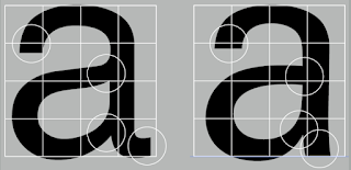
Even typefaces like Univers are not symmetrical (In this case the width of the left slope is thinner). This shows the meticulous care a type designer takes a create letterforms that are internally harmonious and individually expressive.

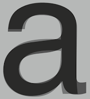
The below image shows the complexity of two seemingly similar sans-serif typefaces of the letter 'a' (Left Helvetica; Right Univers). The finish of the letterforms shows the most notable difference between the two.

Barb: This is angled away from the main point to make extraction difficult.
The x-height generally describes the size of the lowercase letterforms. However, curved strokes, such as in 's' must rise above the median (or sink below the baseline) to appear to be the same size as the vertical and horizontal strokes.


Letters / Form / Counterforms
Just as important as recognizing specific letterforms is developing a sensitivity to the counterforms (or counter) the space describes, and often contained, by the strokes of the form. When letters are joined to form words, the counterforms includes the spaces between them.

A close-up examination provides a good feel for how to balance between form and counter and also a sense of the letterform's unique characteristics. The shape of the 's' holds itself while the 'g' loses its identity. This is because each element is to be examined without the context of the letterform.

The following are some examples of contrast which is the most powerful dynamic in design.

The uppercase letterforms suggest symmetry but it's not. As shown below, each bracket connecting the serif to the stem has a unique arc.
Fig3.1, Stroke
Stroke: The stroke is one of the main lines that make up the appearance of a character.
Even typefaces like Univers are not symmetrical (In this case the width of the left slope is thinner). This shows the meticulous care a type designer takes a create letterforms that are internally harmonious and individually expressive.

fig 3.2, Univers letter 'A'
The below image shows the complexity of two seemingly similar sans-serif typefaces of the letter 'a' (Left Helvetica; Right Univers). The finish of the letterforms shows the most notable difference between the two.

fig 3.3, Helvitica and Univers letter 'A' comparison

fig 3.4, Overlapping of Helvitica and Univers letter 'A'
fig3.5 Barb
Barb: This is angled away from the main point to make extraction difficult.
The x-height generally describes the size of the lowercase letterforms. However, curved strokes, such as in 's' must rise above the median (or sink below the baseline) to appear to be the same size as the vertical and horizontal strokes.

fig 3.6, Letters rising/sinking above/below the median/baseline

fig 3.7, Median and Baseline usage
Letters / Form / Counterforms
Just as important as recognizing specific letterforms is developing a sensitivity to the counterforms (or counter) the space describes, and often contained, by the strokes of the form. When letters are joined to form words, the counterforms includes the spaces between them.

fig 3.8, Forms and counterforms

fig 3.9, Close-up Examination
The following are some examples of contrast which is the most powerful dynamic in design.

fig 3.10, Examples of Contrast
Week 5:
Summary of class:
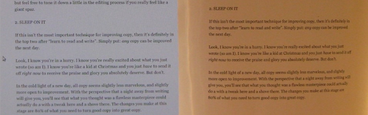
Mr Vinod did a work check about our text formatting( I am Helvetica ver.) and gave us quite a lot of feedback. This is quite a hard exercise because a little bit of a mistake can ruin the layout. After the feedback section, He briefed us about Task 2 and decided on the deadline to hand in our E-Portfolio.
Lecture 5:
Different Medium:Typography exists not only on paper but on a multitude of screens. That includes an operating system, system fonts, the device and screen itself, the viewport, and more. Typography today changes based on how the page is rendered, because typesetting happens in the browser.

fig 4.1, Screen design for website
Print Type Vs Screen Type:
Type for PrintA good typeface for print: Colson, Garamond, and Baskerville are the most common typefaces used for prints because it's highly readable when set at a small font size. They are versatile, easy-to-digest classic typefaces making typesetting with it a breeze.

fig 4.2, Type for print example
Type for Screen
Typefaces intended for use on the web are optimized are often modified to enhance readability and performance onscreen in a variety of digital environments. This can include a taller x-height (or reduced ascenders/descenders), wider letterforms, more open counters, heavier thin strokes and serifs, reduced stroke contrast as well as modified curves and angles for some designs. More open spacing is another important adjustment for typefaces of smaller sizes. All these factors serve to improve overall readability and character recognition for type for screen.
Hyperactive Link/hyperlink
A hyperlink is a word/phrase/image that you can click on to jump to a new document/section within the current document. Hyperlinks are found in most web pages, allowing users to click their way from one page to another. Text hyperlinks are also usually blue and underlined by default. When moving the cursor over a hyperlink, whether it is text or an image, the arrow should change to a small hand pointing at the link.
Font Size for screen
16-pixel text on a screen is about the same size as text printed in a book/magazine. We read books pretty close (often a few inches away) so they are typically set at about 10 points. If you were to read from an arm's length, you would want at least 12 points which is close to 16 pixels on most screens.
System Fonts for Screen / Web Safe Fonts
Each device comes with its own pre-installed font selection based on its operating system. However, each differs by a little. Windows-based devices might have one group while MacOS has another. Google's own Android system uses their own as well.
Some designers tend to use a different font for their site, but if it's not installed or not pulling from a web-friendly place, it will default to some basic variation like Times New Roman which some visitors may find ugly.
'Web safe' ones, however, appear across all operating platforms.
System Fonts for Screen / Web Safe Fonts
Open Sans, Lato, Arial, Helvetica, Times New Roman, Times, Courier New, Courier, Verdana, Georgia, Palatino, Garamond

fig 4.3, Comparison for Print & Screen Type
Pixel Differential Between Devices
Screens on PCs, tablets, phones, and TVs differ in sizes and therefore text on-screen proportions are different too. Because they have different sized pixels. 100 pixels on a laptop is very different from 100 pixels on a 60" HDTV

fig 4.4, Pixel Differential Between Devices
Motion Typography:
In dynamic layout, text elements move in relation to one another. Letters and words may move away from one another on a 2D plane, or in three-dimensional space. Likewise, scrolling typography can scroll across the flat screen or can appear to recede or advance.
Temporal media offer typographers opportunities to “dramatize” type, for letterforms to become “fluid” and “kinetic” (Woolman and Bellantoni, 1999). Film title credits present typographic information over time, often bringing it to life through animation. Motion graphics, particularly the brand identities of film and television production companies, increasingly contain animated type.
Type is often overlaid onto music videos and advertisements, often set in motion following the rhythm of a soundtrack. On-screen typography has developed to become expressive, helping to establish the tone of associated content or express a set of brand values. In title sequences, typography must prepare the audience for the film by evoking a certain mood.
INSTRUCTIONS
<iframe src="https://drive.google.com/file/d/1ETZ1t15aRHQs_Nf3cZu75fLHXUVlBIYM/preview" width="640" height="480" allow="autoplay"></iframe>
Task 1: Exercise- Type Expression:
- Our First exercise used to be sketching out some of the expression sketches from the 4 words chosen by voting. There are 7 words that have been chosen out from among of words which are Dizzy, electric, fire, cry, gun, slide, and freeze. We need to create words based on the 10 fonts we were given without deviating too much from the fonts. Below are my sketches with chosen words: Slide, Fire Cry, and Freeze.
1. Sketches
These are some of the words I sketch for giving me direction for my digitalization. There is only need to choose 4 words for the design but I design more than 4 words to make more choices for good design.

Fig 5.1, sketches for expression (01/10/ 2023)
Definition:
-Slide: Move smoothly along a surface while maintaining continuous contact with it.
-Dizzy: Having or involving a sensation of spinning around and losing one's balance.
-Fire: A process that gives out bright light, heat, and smoke
-Cry: Shed tears, typically to express distress, pain, or sorrow, shout or scream, typically to express fear, pain, or grief.
-Freeze: An act of holding or being held at a fixed level or in a fixed state.
2. Digitalization

Fig 5.2, Final Artwork(Jpeg) Week 3 (01/10/ 2023)
Fig 5.3, Final Artwork(PDF) (09/10/ 2023)
Design of each idea:
1. Slide: The idea is L is the slide in which S, I, D, and E is the participant who will slide on the words L.
2. Fire: The idea comes from the campfire, The base which is the wood is created by a double R, The Words Fire are present as twisted upwards and are to present as properties of fire which which will burn upwards. The small letter built by F, I, R, and E is used to represent the shape of the fire.
3. Cry: The idea is The word C is represented as the face, R is half of the face, and Y is represented as tears, the lighter color of the cry is represented as the pool of water after the tears drop on it.
4. Freeze: The idea comes from an ice cube, the combination of three freezes presents a perfect cube that looks like an ice cube.
3. Animation

Fig 5.4, Progress of animation (09/10/ 2023)

Fig5.5, Progress of animation (09/10/ 2023)

Fig 5.6, Demo Animation (09/10/ 2023)
Design: The Freeze animation is getting the idea of cartoon characters freezing, they will show up like a cube and do shiny reflection.
In my original concept, it should be the items suddenly freeze, so it will have a sudden move to represent a cartoon character who gets frozen, it will totally stop after the sudden move because of freeze but Mr.Vinod says freeze can do like double reflection if doing the movement and better in doing solid reflection.

Fig 5.7, Progress for the animation (15/10/ 2023)

Fig 5.8, Progress for the animation (15/10/ 2023)
Final animation:

Fig 5.9, Final Animation (15/10/ 2023)
Task 2: Exercise-type Text formatting:
- Our second exercise is using Adobe InDesign to create a single layout by various aspects of text formatting such as Kerning and Tracking(letter spacing), Font size, line length, Leading and Paragraph spacing, Alignment, Text Fields and Ragging, and more. This exercise will allow us to learn and improve our ability of arrangement and information hierarchy skills.
For this exercise, we watched a video that teaches us how to tracking and kerning in Adobe InDesign. We then were to put our names with 10 different typefaces we are going to be using and format it as the per image below.
Fig 6.1, without tracking and kerning (20/10/ 2023)
Fig6.2, with tracking and kerning (20/10/ 2023)
Final : I am Helvetica:

Fig 6.3, Final text format (Jpeg) without grid (21/10/ 2023)

Fig, 6.4, Final text format(Jpeg) with grid (21/10/ 2023)
Fig 6.5, Final text format (PDF) without grid (21/10/ 2023)
Fig 6.5, Final text format (PDF) with grid (21/10/ 2023)
Final Text Format Detail:
- Head:
Type Size: 69pt
Leading: 72pt
Leading: 72pt
Paragraph spacing: 11pt
- Body:
Type Size/s: 8
Leading:11
Paragraph spacing: 11pt
Characters per line: 45-50
Alignment: left align
- Margins:
Columns: 3
Gutter: 5mm
FEEDBACK
Week 1:
E-portfolio
Specific Feedback: -
General Feedback: Strengthen the E-portfolio by referencing the past student format. Set up the blog and fill in the link try to sketch more ideas as you can.
Week 2:
-Specific Feedback: make documents and pictures for your lectures. Utilize the knowledge gained and exercise your own judgment when correcting, refining, or developing your work. Be confident, careful, independent, critical thinking, ability to apply knowledge, self-reflection, careful with the distortion and effect, and trust in yourself in order to learn.
-General Feedback: Be confident and careful about ideas and do not distort the words provided. and be careful not to use too strong an effect to distort the word or break the original work.
Week 3:
-Specific Feedback: Always do the update for the blog and need to update the further reading.
-General Feedback: Be disciplined to update the blog and feedback.
Week 4:
-Specific feedback: For the word freeze, the freeze can do like double reflection if doing movement, but it is better to do solid reflection.
Blog: Always copy for your blog and put it in words.
-General feedback:
Blog: Always copy for your blog and put it in words.
-General feedback:
Week 5:
-Specific feedback: when you want to create a layout, do not use too two fonts of two different serif fonts together. The using of two fonts is doing contrast. Use the same fonts for the headline and text together.
-General feedback:
REFLECTIONS
When I started my typography class, I didn't know much about what it was about, I thought it would be a class like what I learned in Design Basic. After a few classes of lectures, I found that typography is more in-depth than I expected. There is a lot of learning and knowledge needed to master this subject maybe it will be forever I guess.
Observations:
Observations:
I started to notice typography appear in our surroundings of us. All the image or view in my eyes whether from game, real life, book, or random sign appear anywhere that can be observed and become an idea of typography. I found out that typography just slowly became a part of my life, I hope I can improve my typography more by observing and my creativity.
Findings:
Findings:
I found out that references are very useful in creating ideas, either from masterpieces from lots of designers all around the world, or past year students or those looking for a good idea from the internet. The design always inspires me to create more ideas in my head.

FURTHER READING

Fig 7.1, The Vignelli Cannon by Massimo Vignelli
Introduction:
I chose the Vignelli Cannon by Massimo Vignelli for my first book in further reading which is one of the recommended books by Mr Vinod. Its book could become a useful instrument for a better understanding of typography in Graphic Design.
The first part of the book is about the Intangibles. The Intangibles is formed by Semantics, Syntactics, Pragmatics, Discipline, Appropriateness, Ambiguity, Design is One, Visual Power, Intellectual Elegance, Timelessness, Responsibility, Equity
Semantics
Is the search for the meaning of
whatever we have to design. That may start with research
on the history of the subject to better understand
the nature of the project and to find the most
appropriate direction for the development
of a new design.
Depending on the subject the search can take
many directions. It could be a search for more
information about the Company, the Product,
the Market Position of the subject, the
Competition, its Destination, the final user, or
indeed, about the real meaning of the subject and
its semantic roots.


Comments
Post a Comment